
A-Frame Cat
for The Print Shop ATL
Project Type::Illustration, Print Design, Motion Design
Role: Sole Creative
Timeline: Mar 2025
Client: The Print Shop ATL
I was asked to create a poster for The Print Shop ATL by Freemarket, a local Atlanta print shop that showcased artists from the area, selling their work in a range of framed and unframed print sizes through both a digital storefront and in-person popups. My poster, if selected, would be part of The Print Shop x GSU Collection, featuring artists and designers from my school, Georgia State University. All participants were given free rein to create any kind of artwork or design.
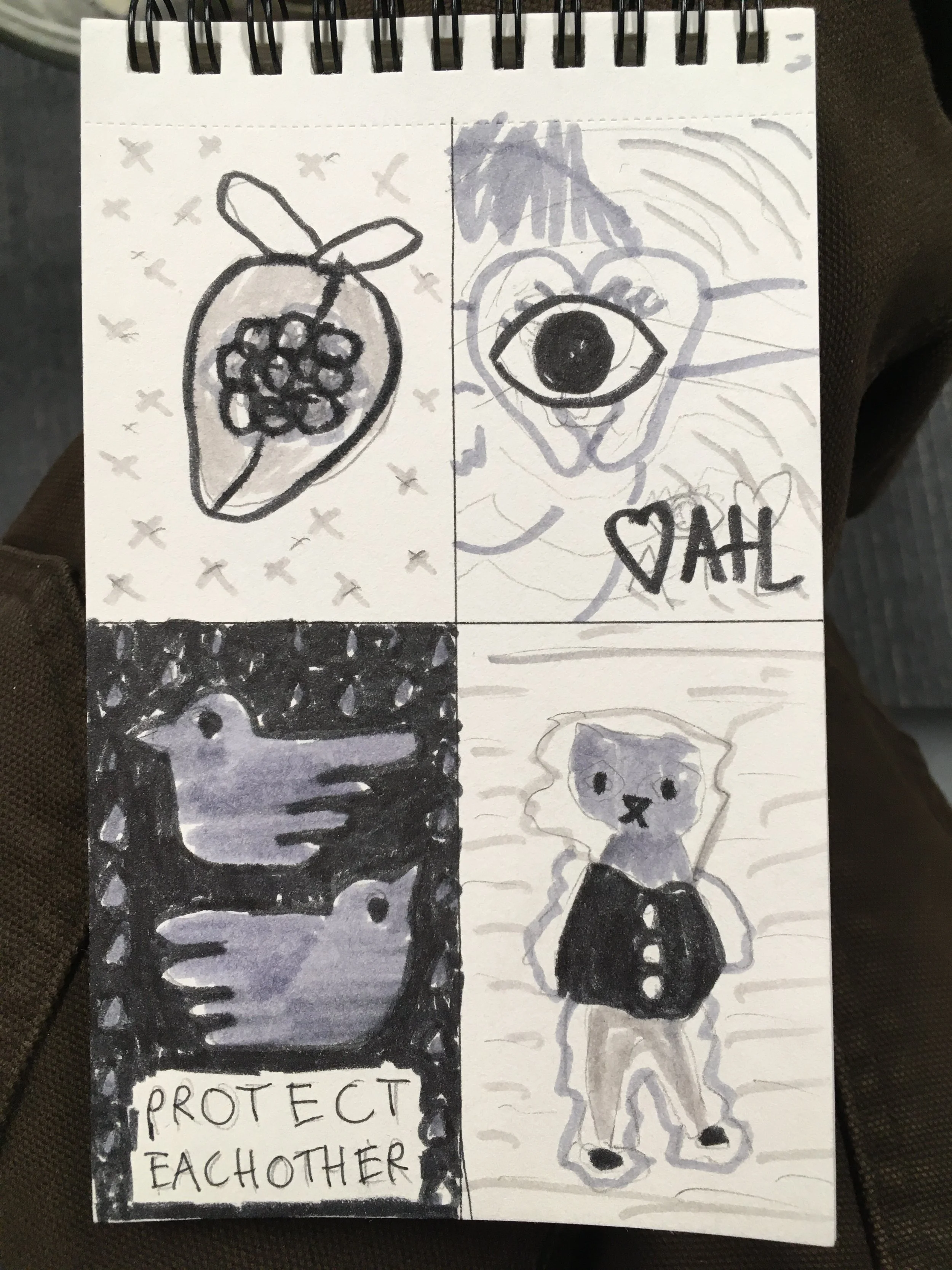
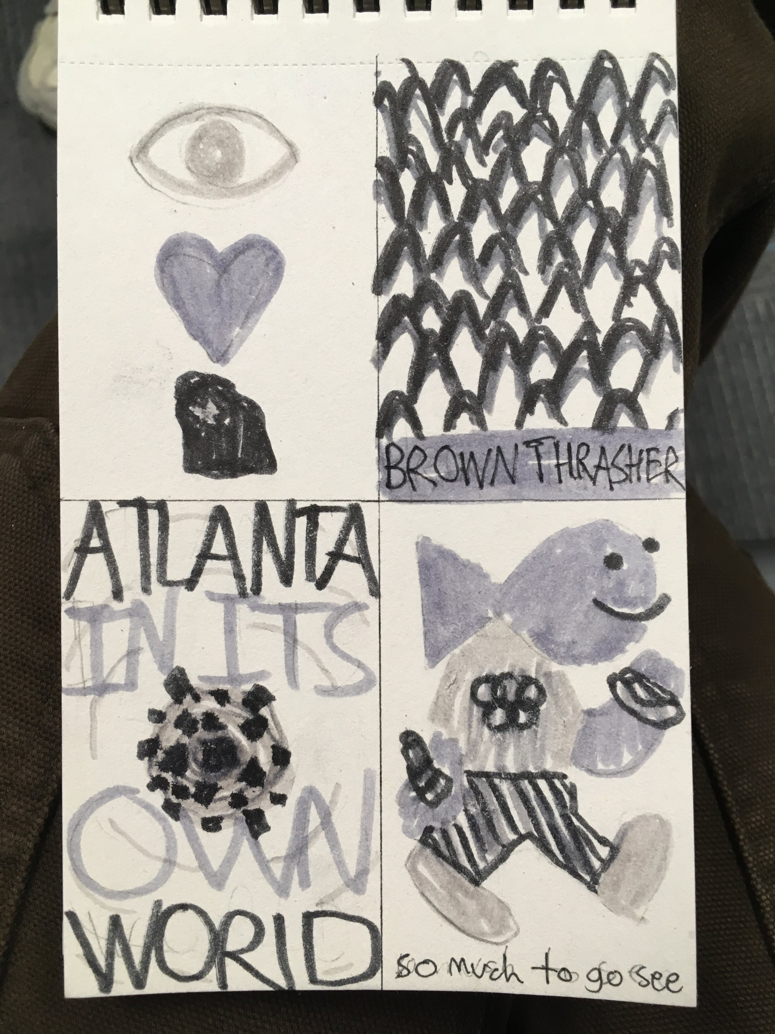
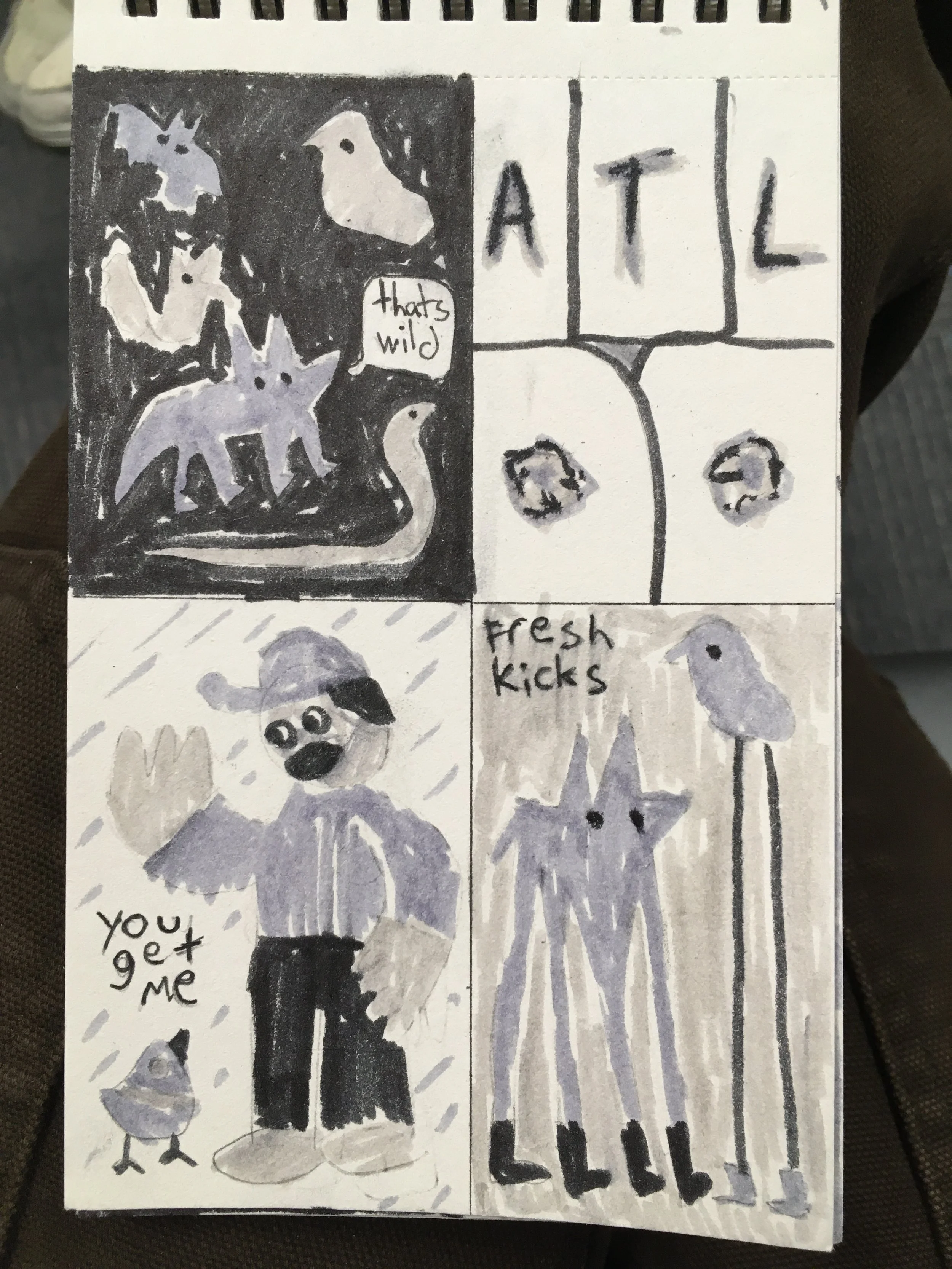
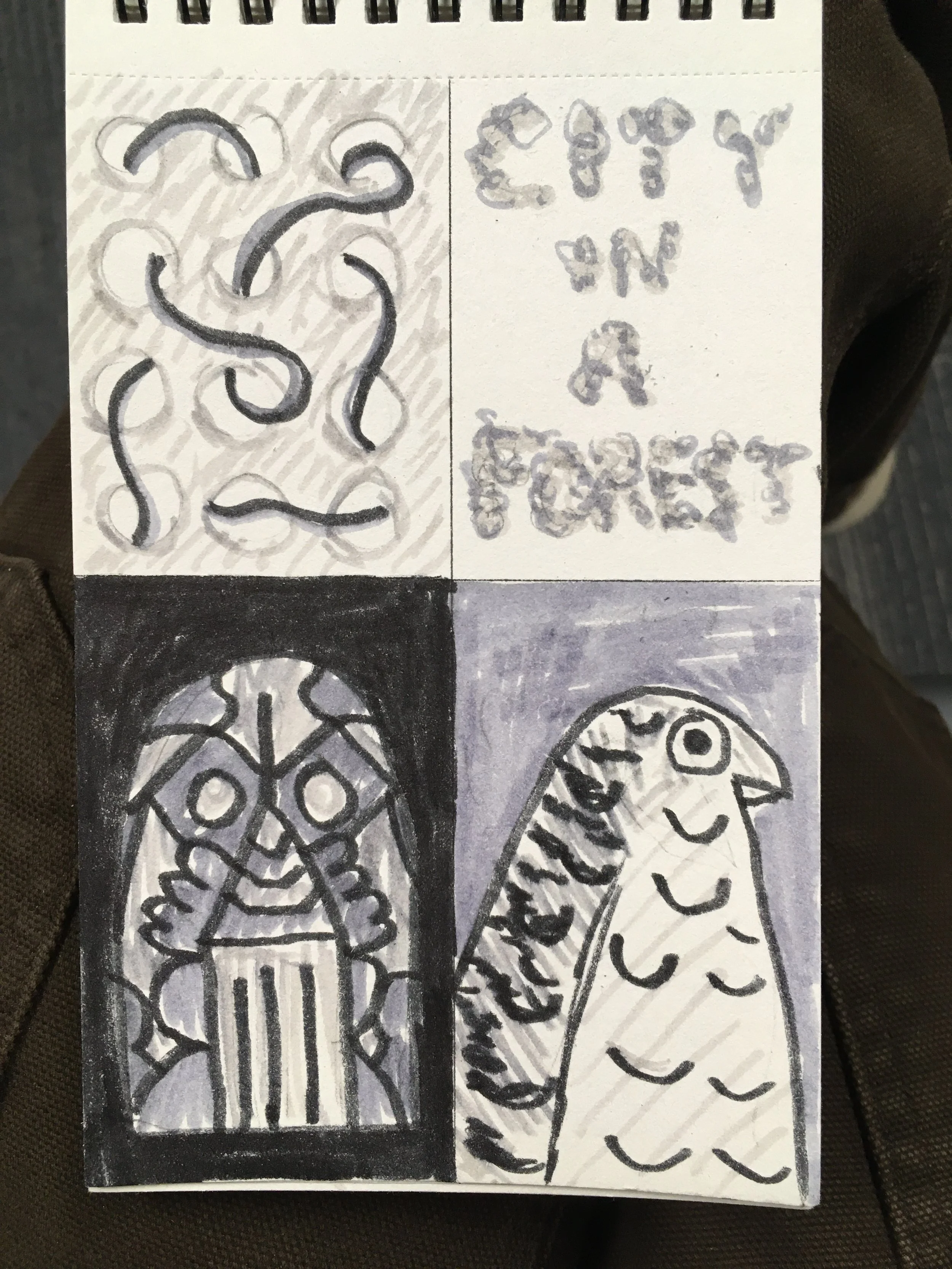
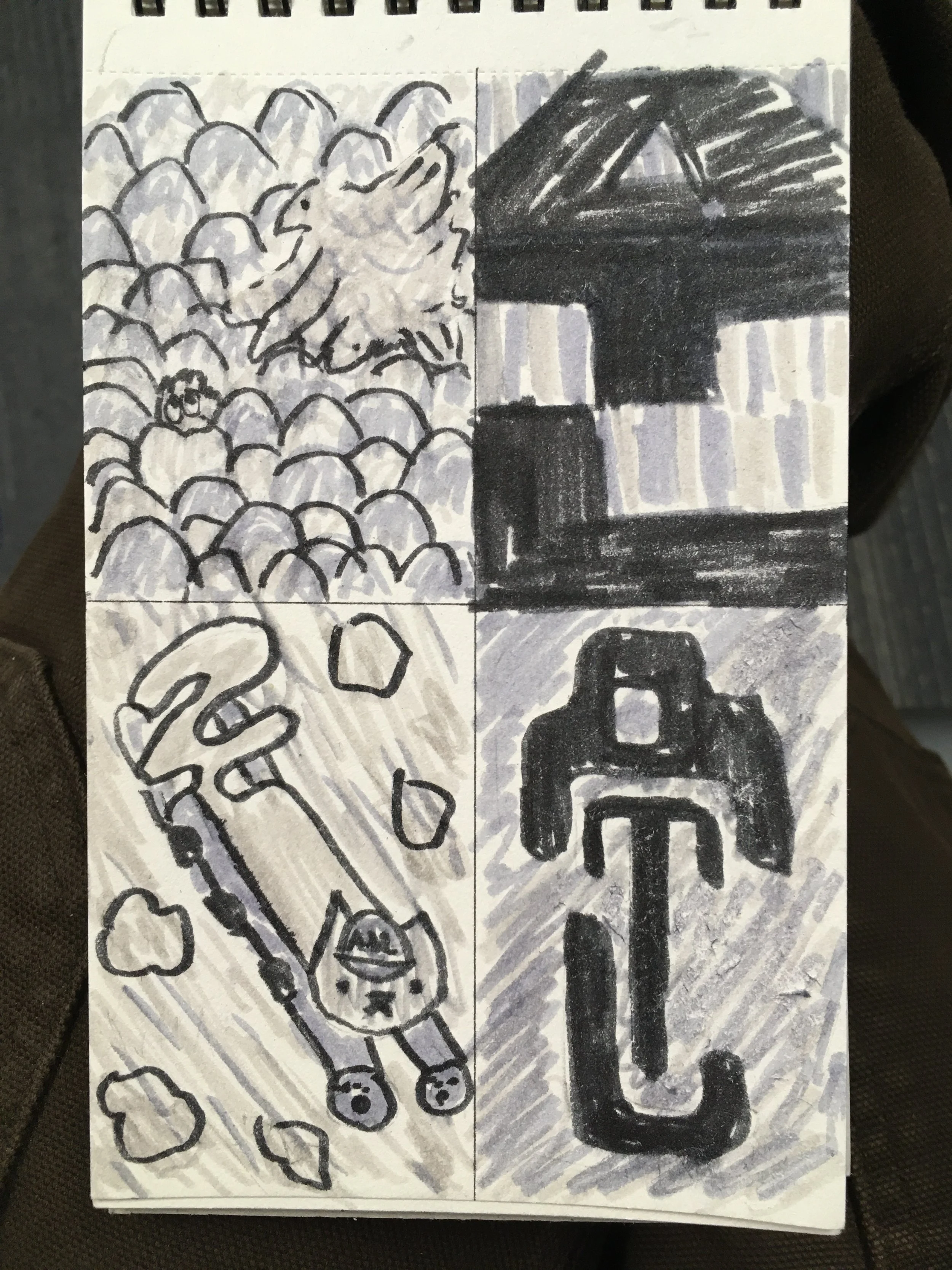
Thumbnail Sketches
Having been granted complete creative control, I started sketching poster ideas before deciding on a concrete concept, letting myself explore a range of compositions. Motifs between the sketches naturally formed, with many of them featuring bold, straightforward iconography and nods to Atlanta.
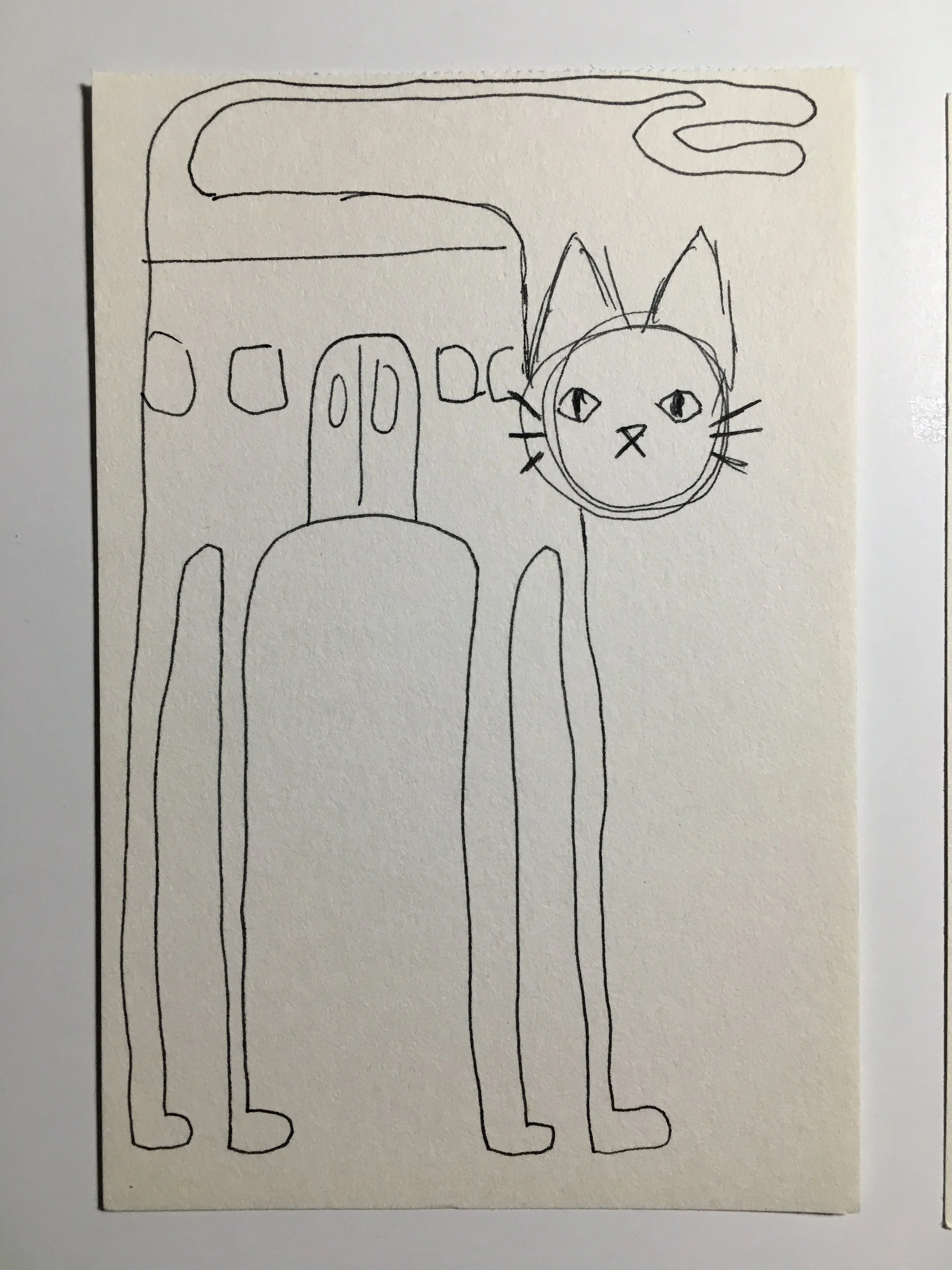
Finding Direction
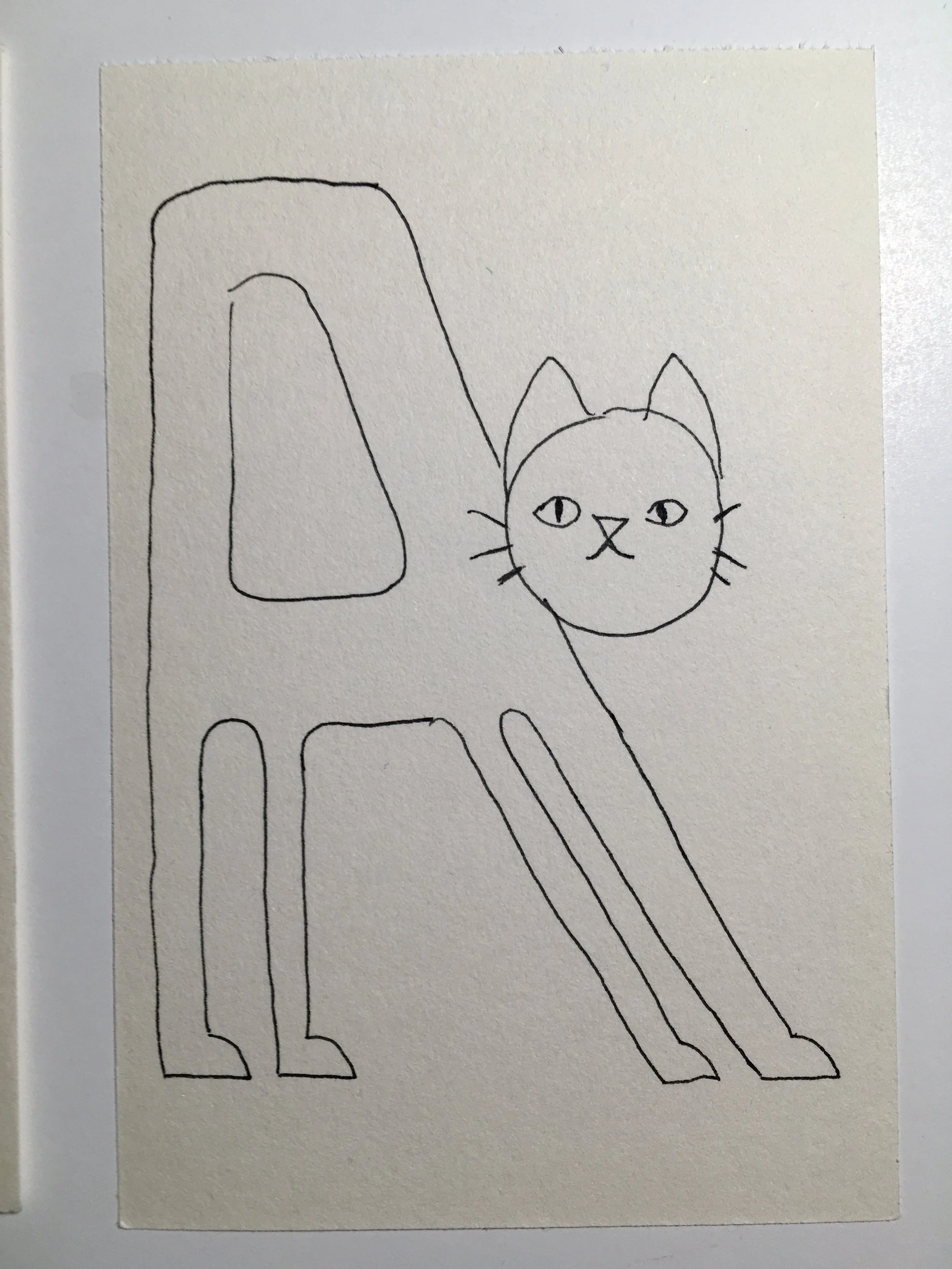
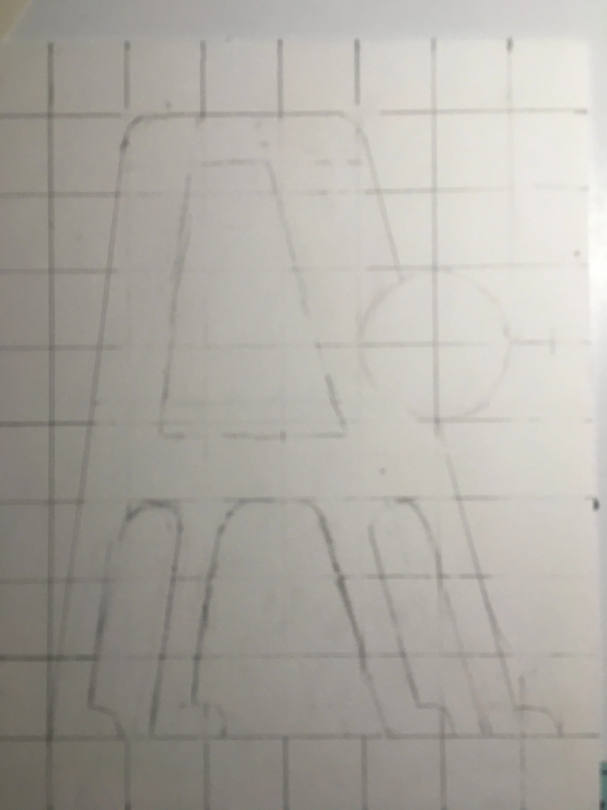
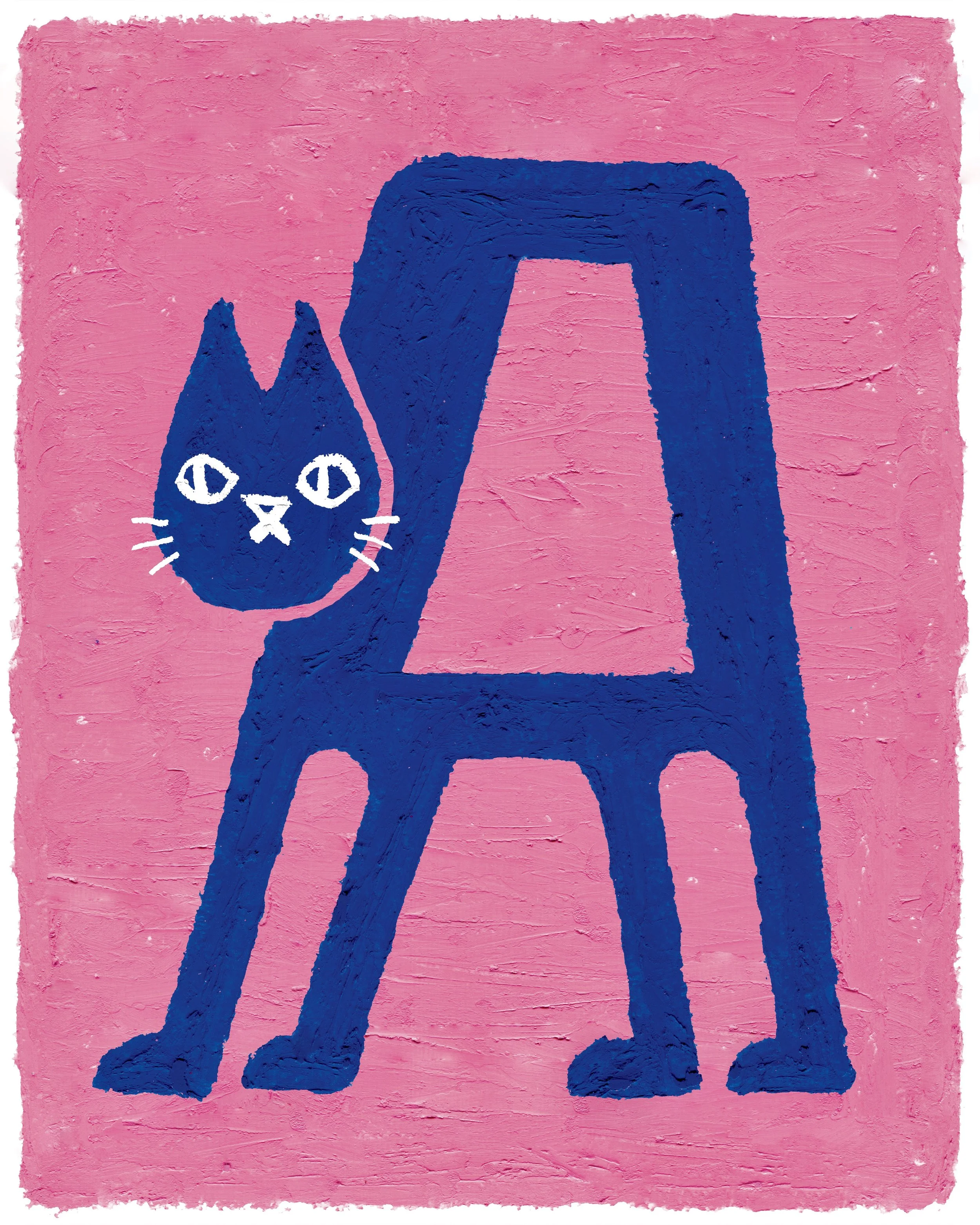
After combing through my sketches, I was drawn to one in particular that featured a giant cat with a MARTA train as its body, inspired by the Catbus from My Neighbor Totoro. I went on to iterate on the concept through more sketches, and to my own surprise, it quickly pivoted to a new direction. The perspective flattened, and what was once a cat with a train for a body became a cat with a figure cartoonishly shaped like a capital “A”.
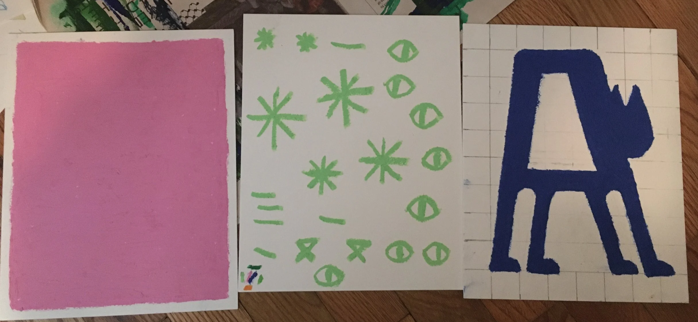
Pastel Drawing
Endeared by the cat’s new design, I wanted to use a medium that matched its playful, slightly absurd nature. Oil pastels felt like a perfect fit, but thinking ahead, I was concerned about unintentional color blending and losing the bright contrast I’d begun to envision in my head. Still, I was determined to use the medium. Bringing digital art techniques into a physical medium, I created each part of the poster in layers on their own canvases, ensuring none were blended or deformed.
Digital Assembly
Using a flatbed scanner, I captured high quality photos of each pastel layer. I then cut out each one carefully in Photoshop, and, after resizing and touching up any blemishes, layered them accordingly. Thanks to the quality of the scans, the composition retained visibility of its oil pastel texture, while the digital assembly ensured perfect, unblended edges, creating the bold, bright contrast I had hoped for.
Size Formatting
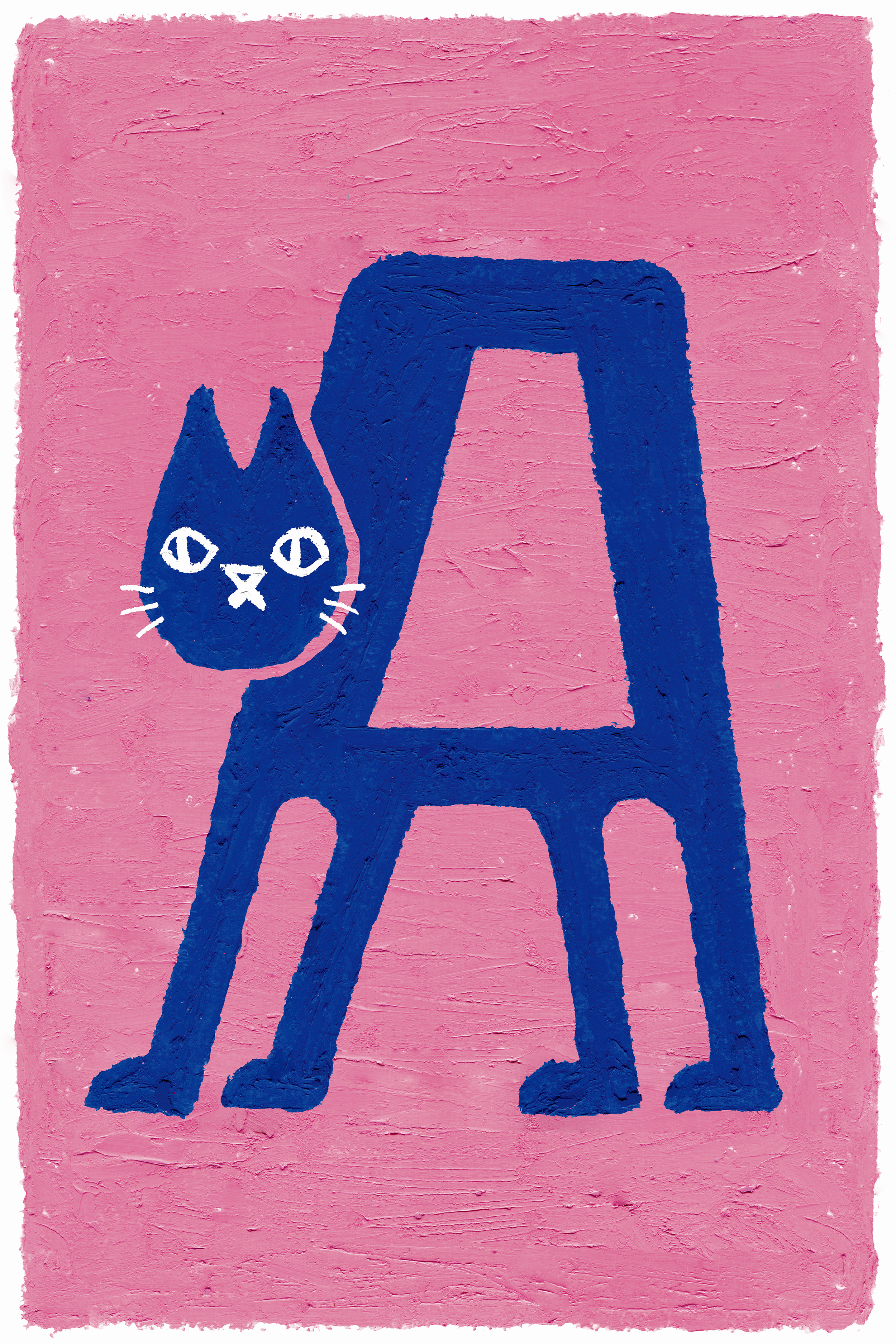
The poster had to be formatted for a second aspect ratio to ensure it wasn’t awkwardly cropped at certain print sizes. This was a quick process for my poster design. I resized the pink background by cutting and stitching it back together, using several Photoshop techniques to ensure it looked seamless and natural with the pastel strokes.
Animation
I created a short, looping animation to promote the poster. Thanks to the digital layering, importing the artwork to After Effects was a smooth process. I wanted to make the cat yawn in an exaggerated, cartoonish manner that matched its quirky style. Through using scale, creating open mouth and closed eye states for the cat, and applying effects to the cat’s body layer, the yawn came to life. I added blinking to give it a little more life, and finally, I had fun recording and distorting my voice to create sound effects for the animation.