
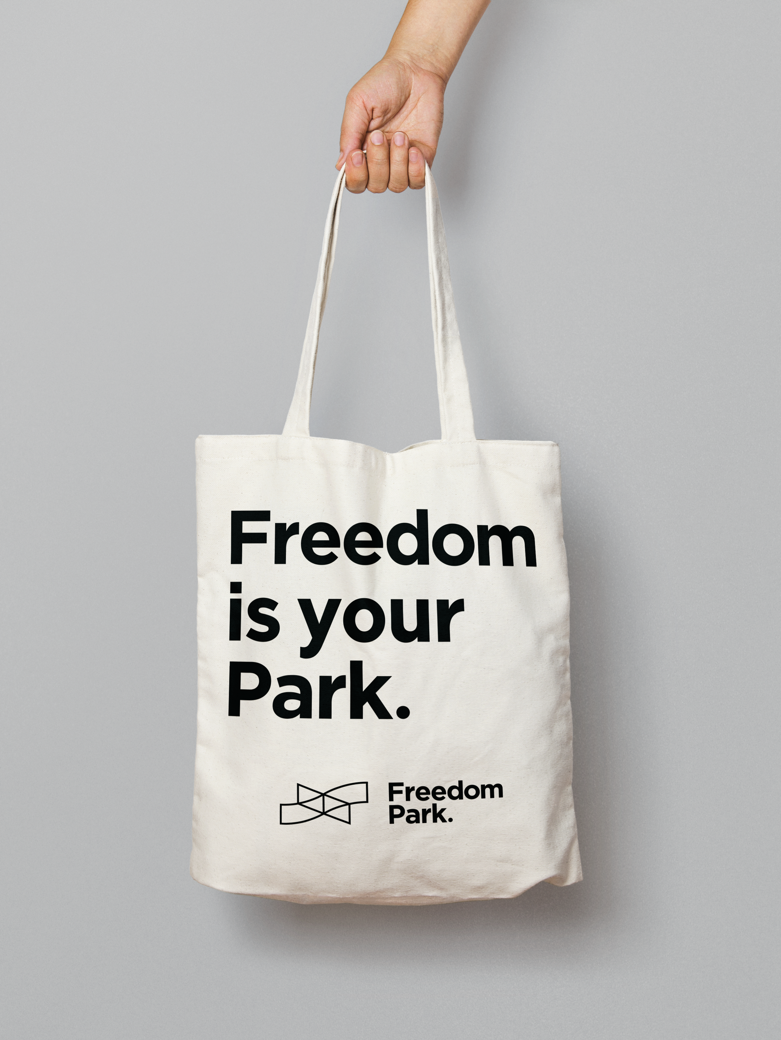
Freedom is your Park
Brand Campaign
Project Type: Branding, Signage, Product design
Role: Design and Marketing team member
Timeline: June 2025 - January 2026
Client: Freedom Park Conservancy
As part of a two-person design and marketing team, I helped develop and pitch a brand campaign and create graphics, assets, and print-ready files for Freedom Park, a historic and iconic park spanning multiple neighborhoods in the heart of Atlanta. We frequently communicated and met with members of the Freedom Park Conservancy board throughout the process to respond to budgeting, board feedback, and any other factors that would require us to quickly adapt and pivot.
Goals
Create more recognizable, standout brand material for the park.
As part of a larger investment in the park, more clearly adorn the park with signage and way finding, a necessary goal due to the park’s unorthodox shape and boundaries.
Encourage donations to the Freedom Park Conservancy, and provide donors with meaningful ways to display their support.
Research
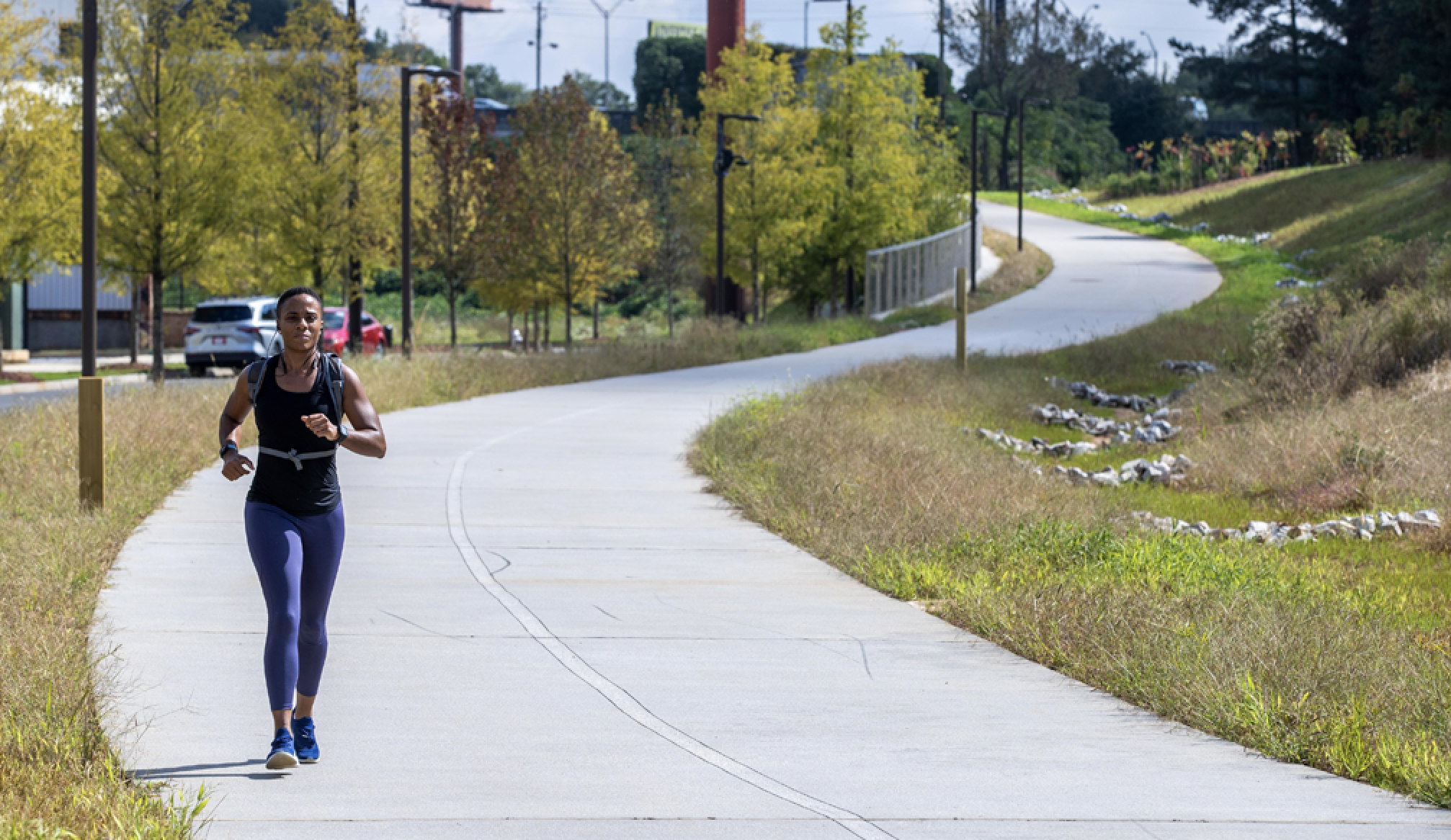
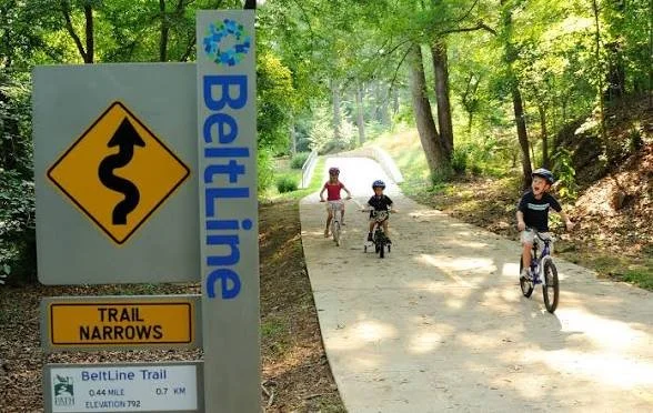
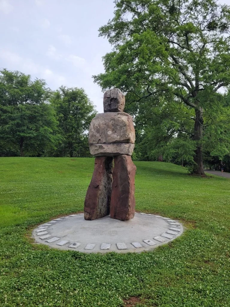
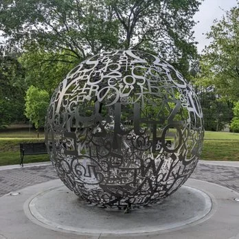
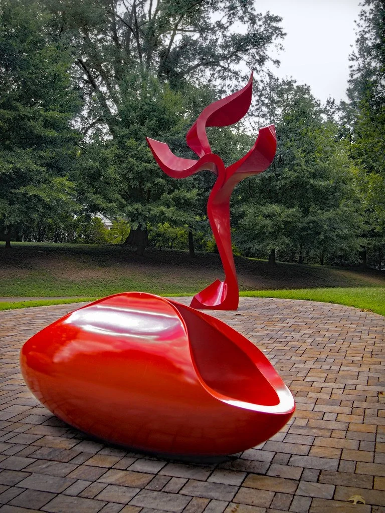
Freedom park has a long and inspiring history charting its creation and lasting legacy. We had no doubt that immersing ourselves in its history was the place to start, and took the time to learn what the park means to the Atlanta community. We studied its legacy as a proposed site for a highway protested by community members. We reveled in its unique features, like connecting multiple neighborhoods and the centers for two different Nobel Peace Prize winners. We observed the park’s strong appeal to bikers and runners, and its ever-changing array of installation art.
Concept Development
In discovering and admiring the unique history and features of Freedom Park, our campaign concept came to life. The things that make the park so unique are why so many Atlanta community members cherish the park already. Thus, if we could raise awareness of its unique features, celebrate them, and make them a proud part of its branding, we hoped that more and more people would visit and support Freedom Park.
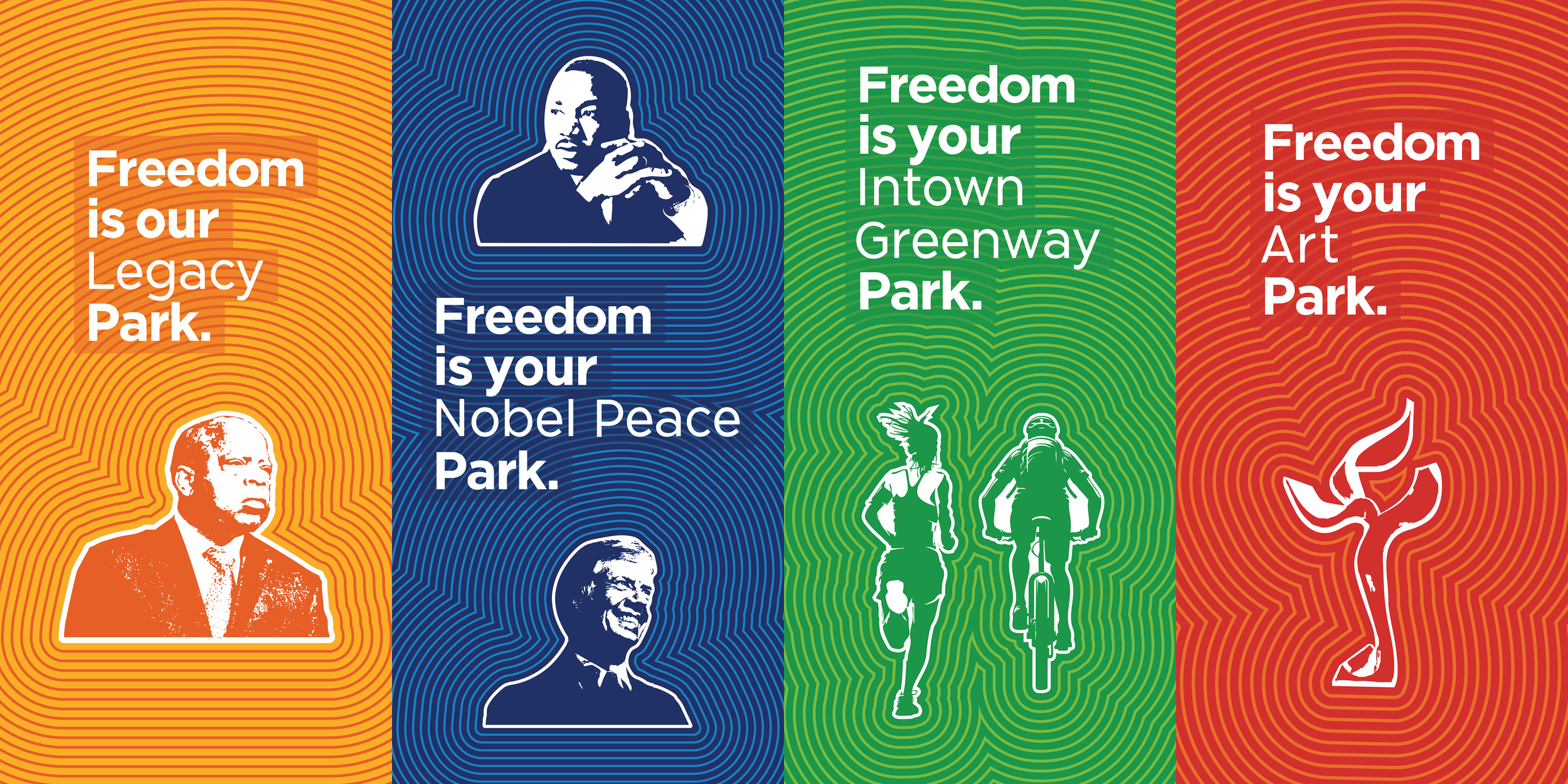
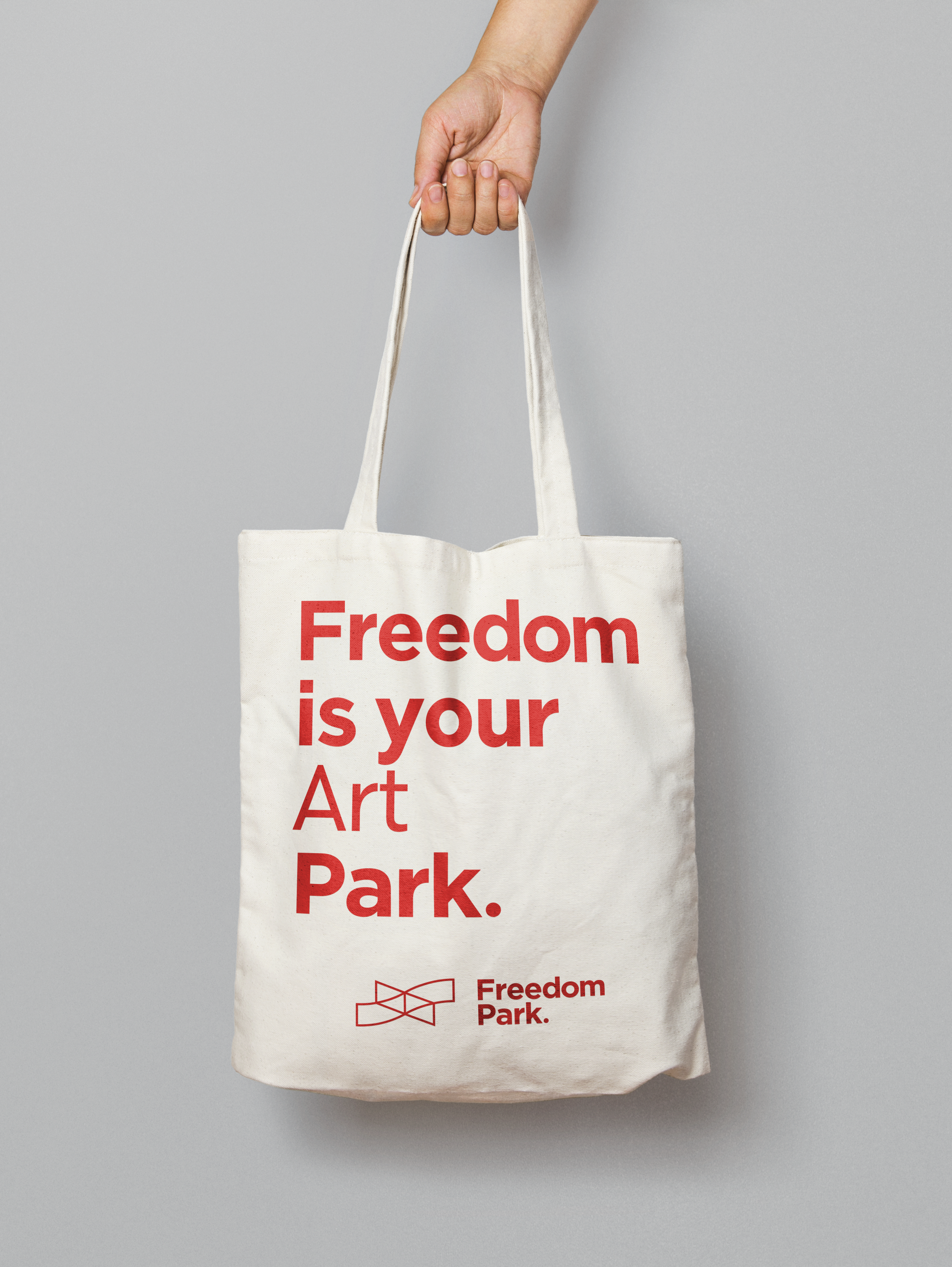
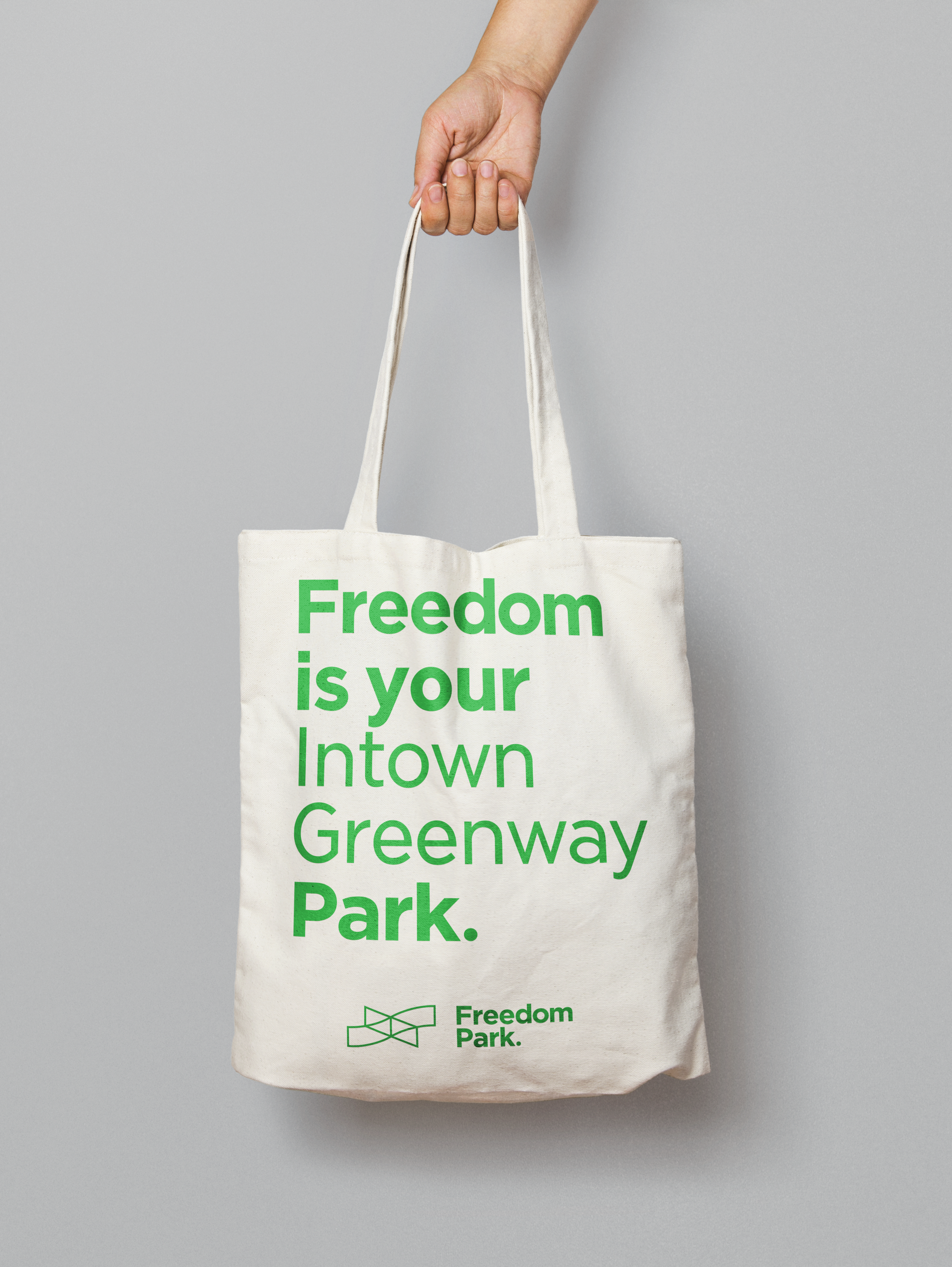
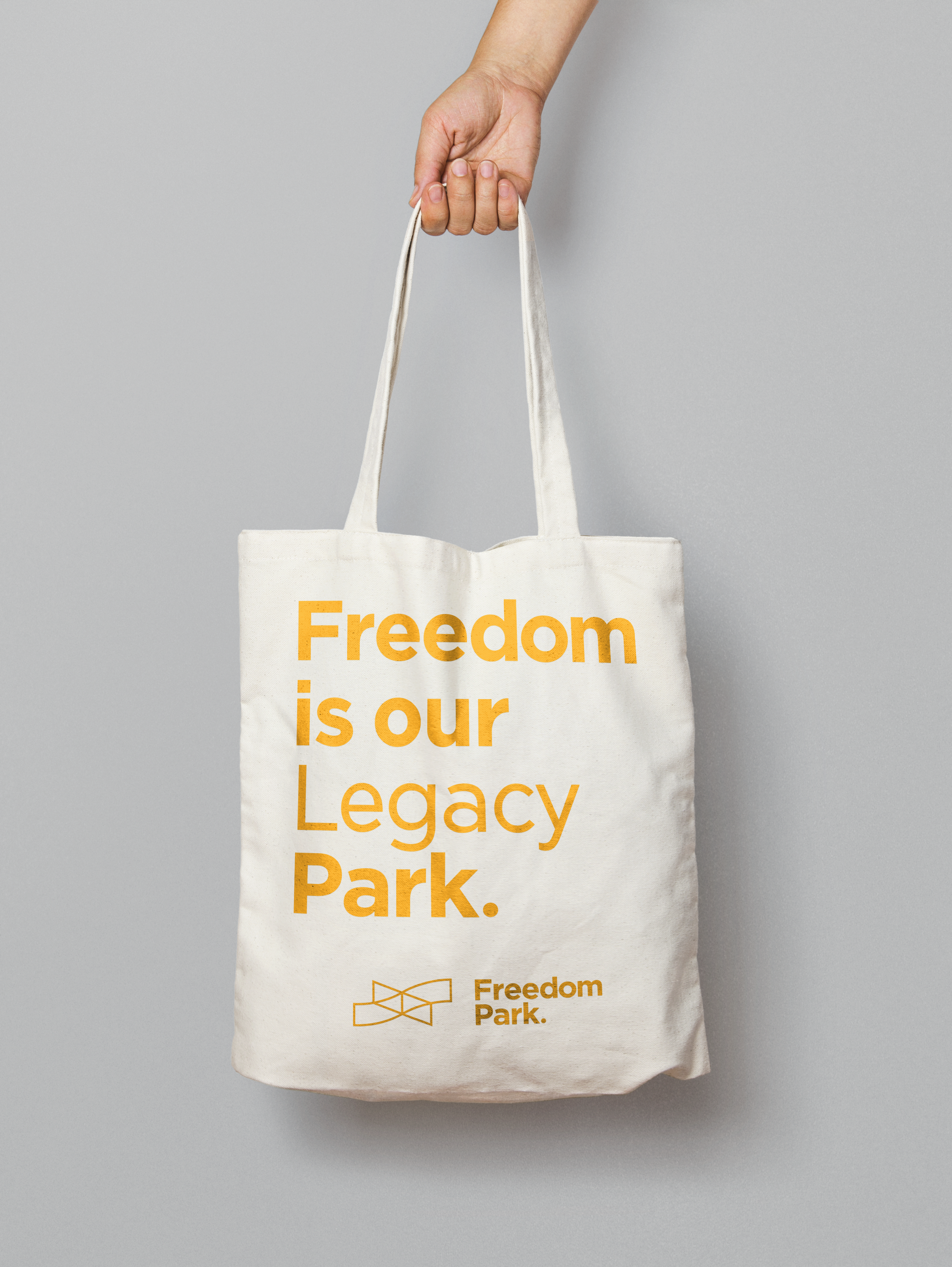
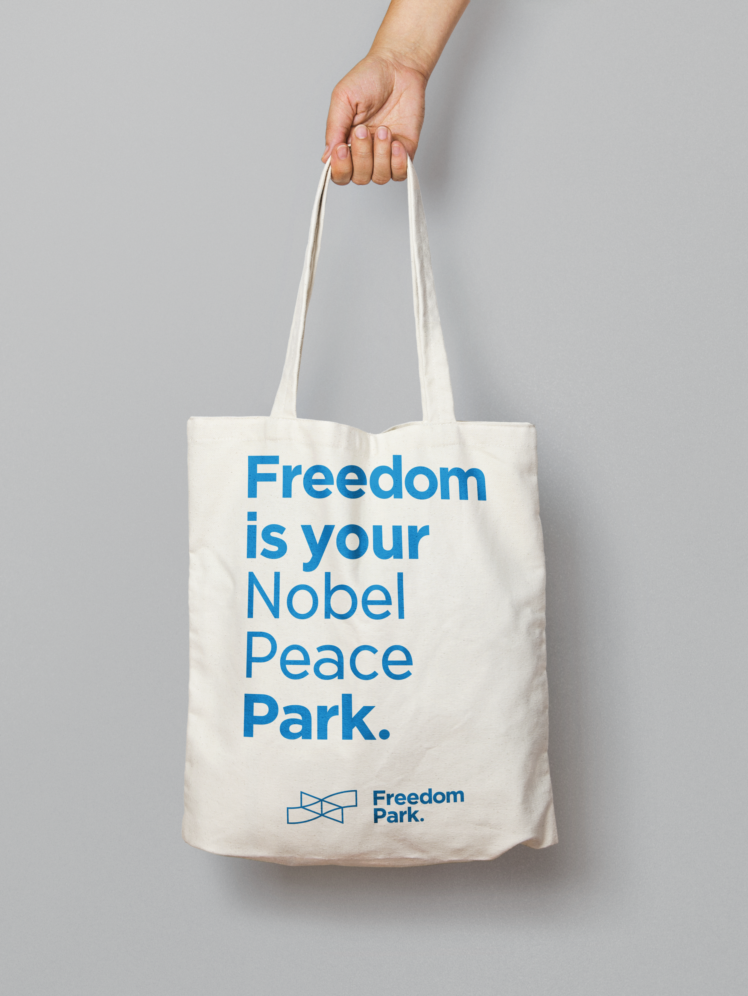
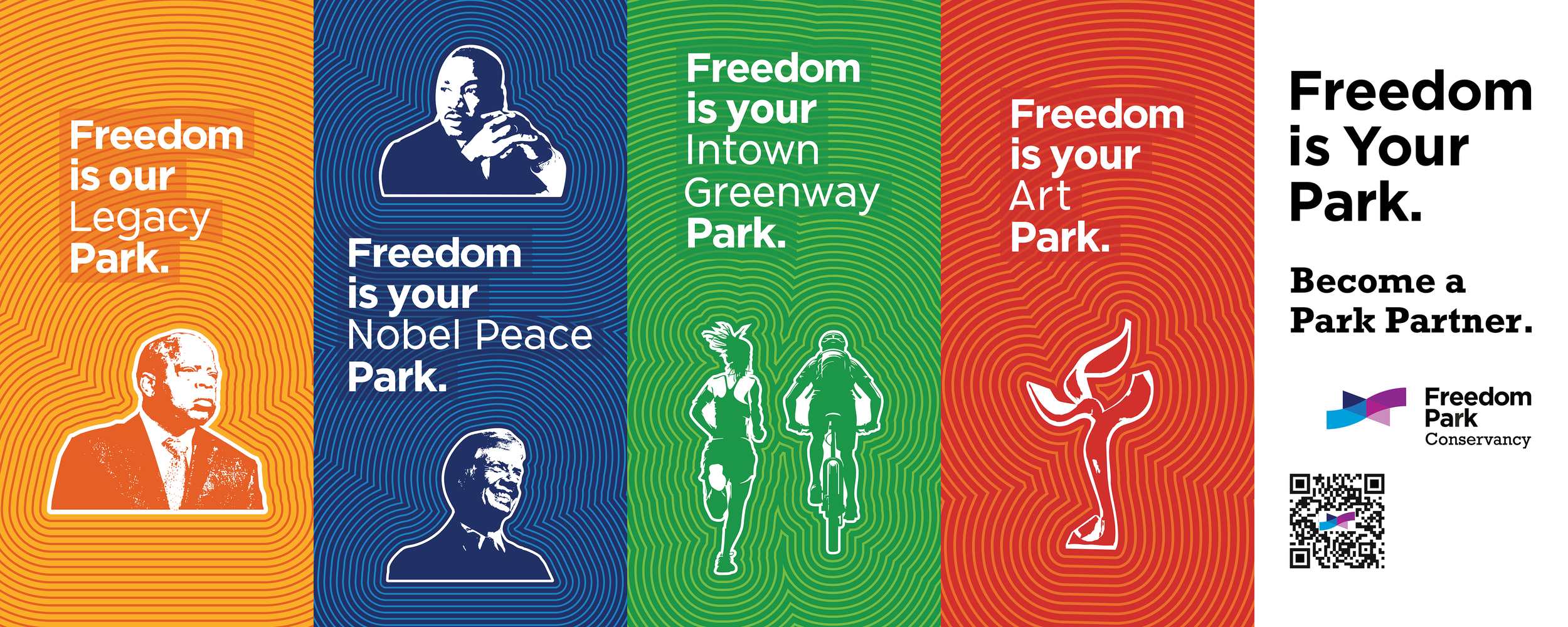
Based on our research and conversations with Freedom Park Conservancy board members, we narrowed the park’s unique features into four pillars. The park had an existing tagline: “Freedom is your park”. Using the pillars we had defined, we created four new variations of the tagline highlighting each one.
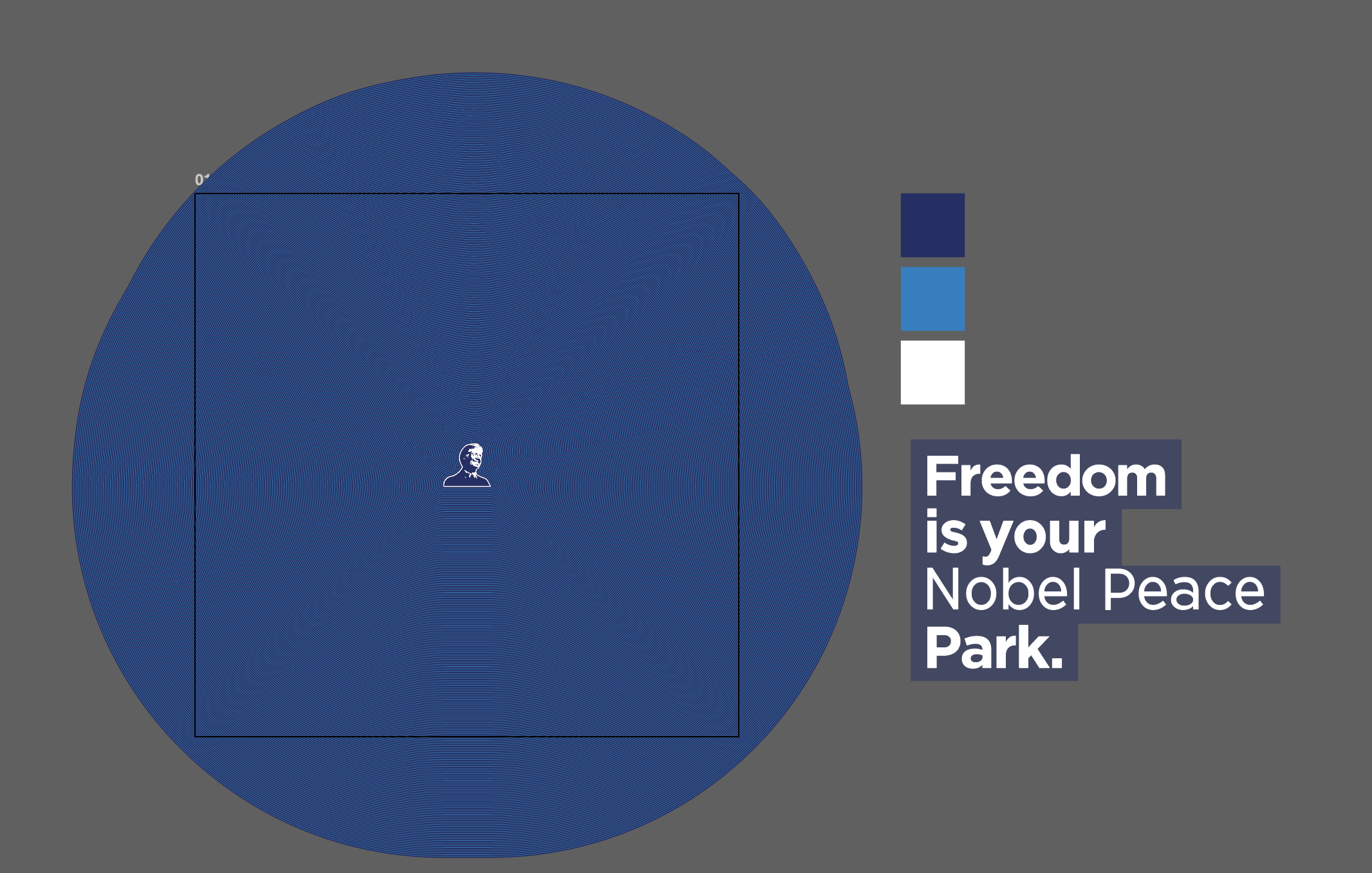
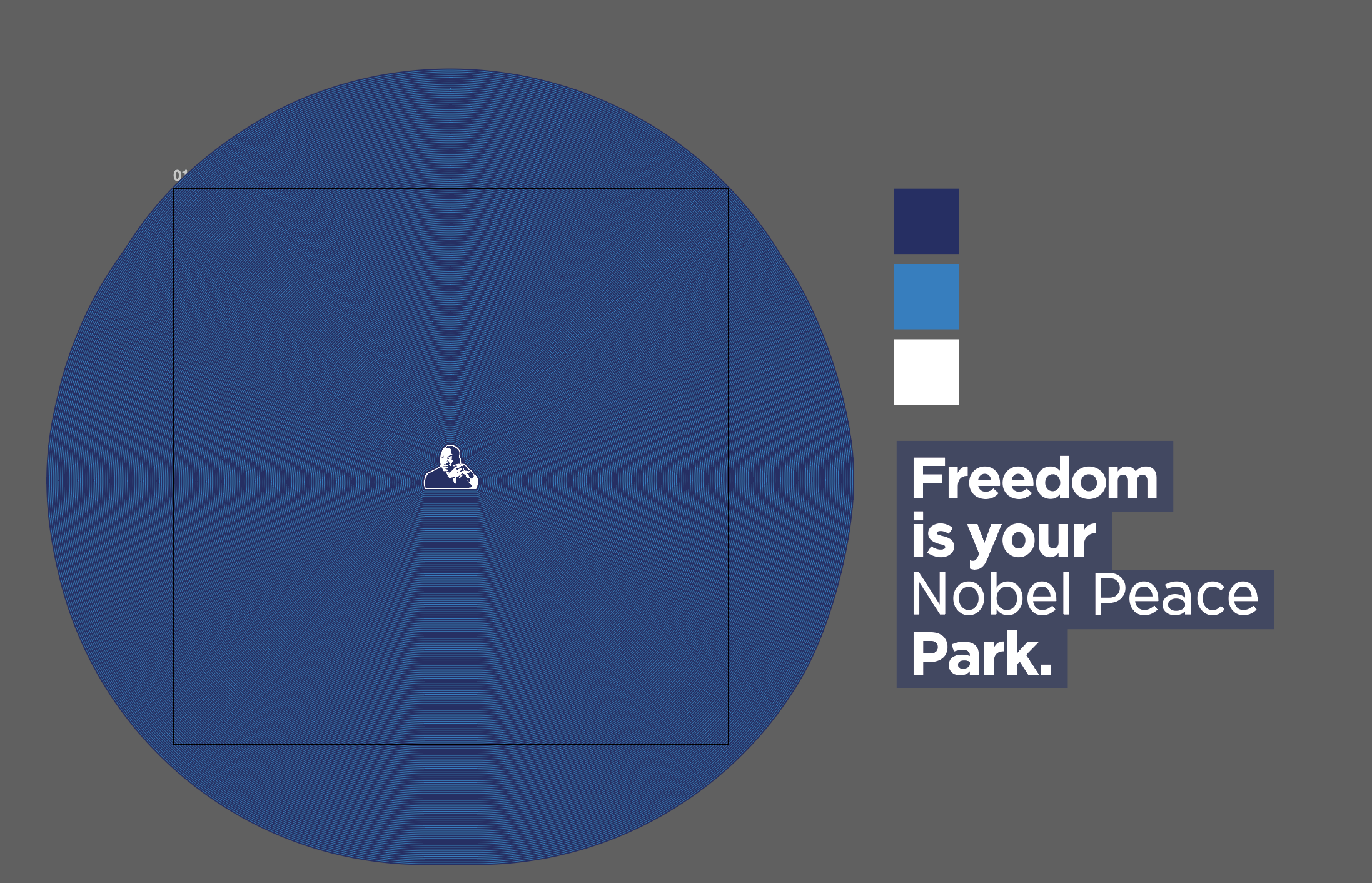
Freedom is your Nobel Peace park
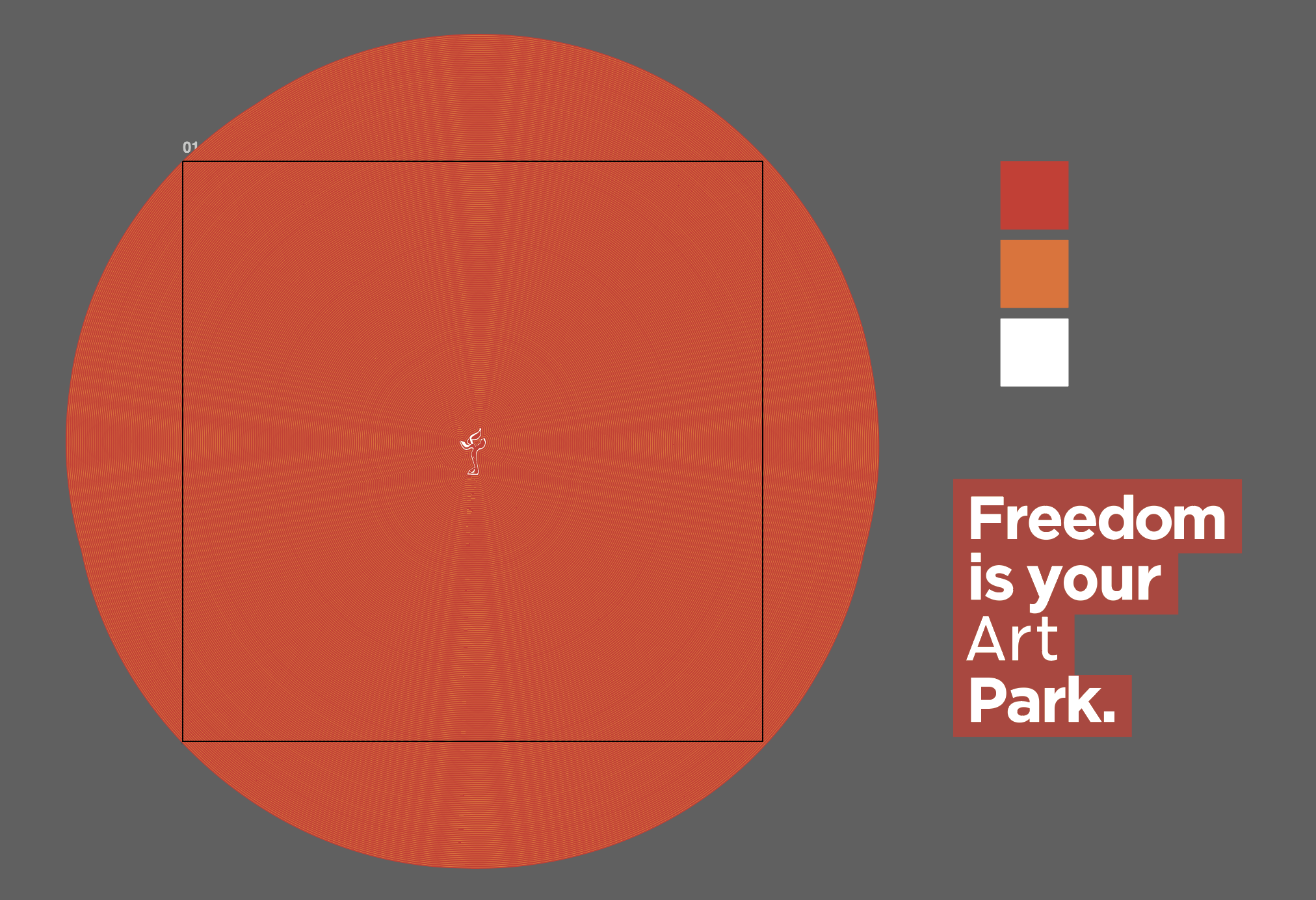
Freedom is your Art park
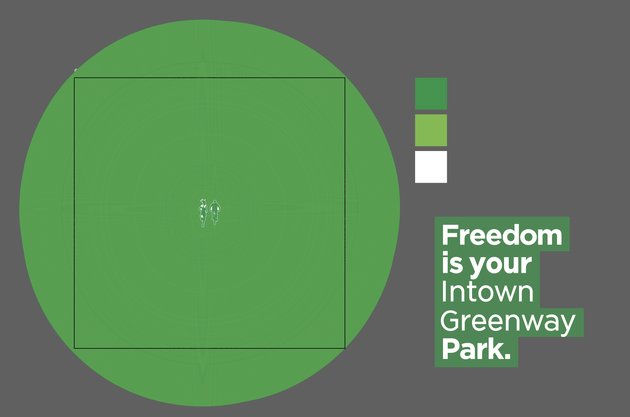
Freedom is your Intown Greenway park
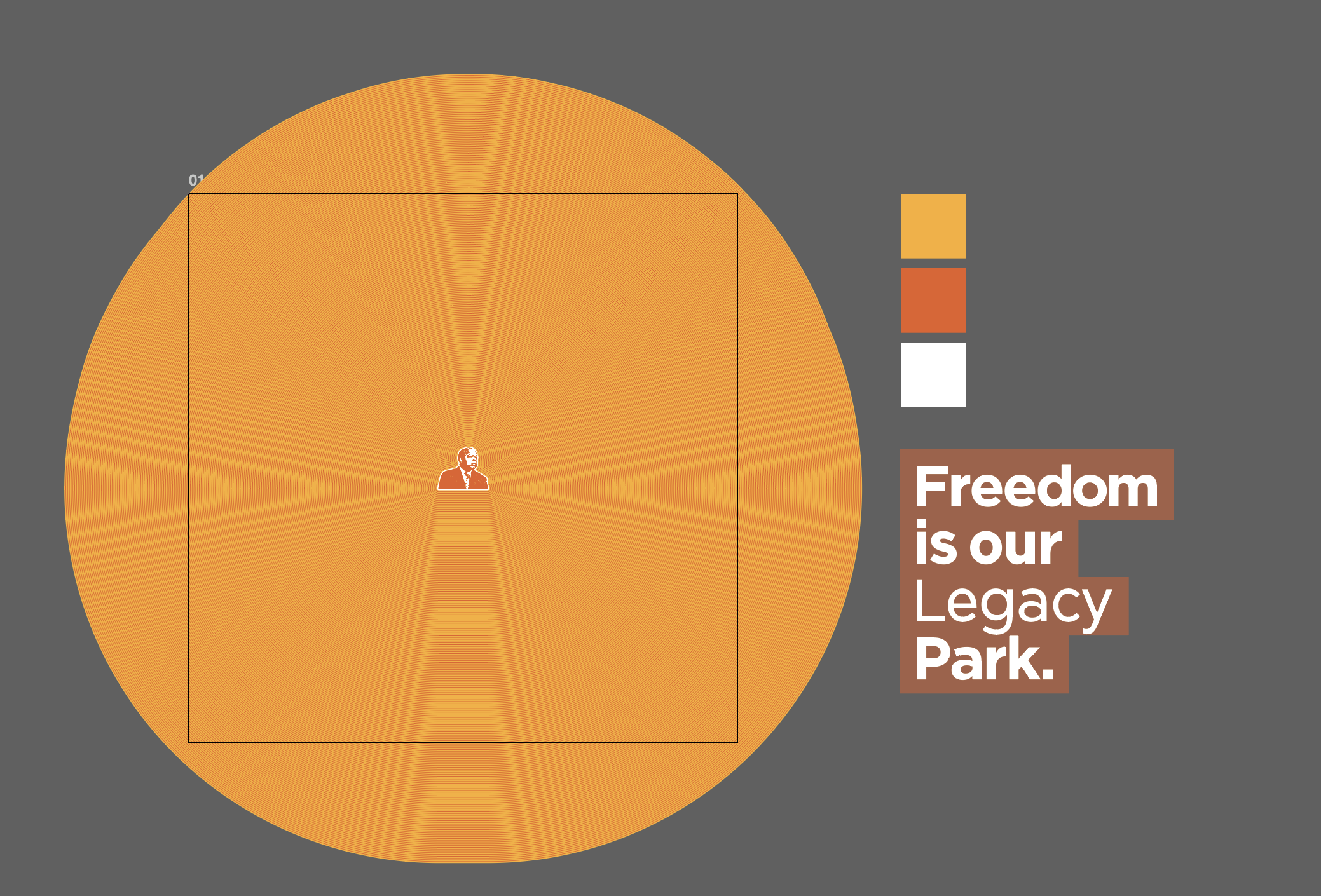
Freedom is our Legacy park
lightpole banner graphics
Visual Reference Sourcing
The park had a standing visual identity that was previously created as part of a lengthy master plan. However, it was seldom used outside of their website. It was quickly decided that we would utilize the typefaces, logos, and colors outlined in the visual identity. Some of the most visually striking parts of the master plan document were its title slides. These slides featured the Freedom Park logo with a bold, flat, endless ripple effect alternating between two shades of a single color.
Designing Graphics
We were inspired by these slides, so much so that they quickly became the blueprint for the visual direction of the new campaign. Each color range, we decided, could correlate with one of our new tagline variations. Rather than use the logo, each of the four graphics would feature imagery pertaining to its tagline. The imagery was stylized like a stencil to retain the bold, flat contrast of the document slides. We had to pay special attention to sizing and placement to ensure that the ripple sizes appeared uniform enough across the four graphics.
adaptable working illustrator files
Adapting to Banners
Most of the graphics, featuring only a single stencil image, adapted easily to any format by simply moving the tagline text. However, when adapting the “Nobel Peace” graphic to a vertical format, we had to develop a new system of setting up the graphic files, so that the intersecting ripples could be changed for new formats.